Jess L McPeak

Davis Chamber Players branded concert poster and program materials

Brand identity & concert design for the Davis Chamber Players

The Davis Chamber Players is a chamber-music concert series in Davis, California, where each season brings together local student, amateur, and professional classical musicians from the Davis & Sacramento areas for free community concerts.

I've been DCP's freelance graphic designer since 2023. The engagement began with a brand redesign and has grown into an ongoing role designing the materials for each concert season. The thread running through all of it was a single, flexible identity.

Davis Chamber Players monogram combining a bass clef and a penny-farthing wheel

A bass-clef monogram

DCP came to me with an existing but dated identity. The redesign needed a mark that was legible and felt at home across a variety of media and contexts. I worked through it in three stages in Adobe Illustrator.

I started with the wordmark alone, exploring serif versus sans, uppercase versus lowercase, weight, and how the words stacked. This narrowed the voice to a high-contrast classical serif set in a compact lockup.

Next I brought in musical forms and Davis iconography: treble & bass clefs and penny-farthing bicycles; testing how the wordmark could sit with them.

The winning direction paired a circle with a bass clef to create the form of a penny-farthing, with the wordmark sitting inside the larger wheel. Recognizable at a glance, and built to survive manipulation.

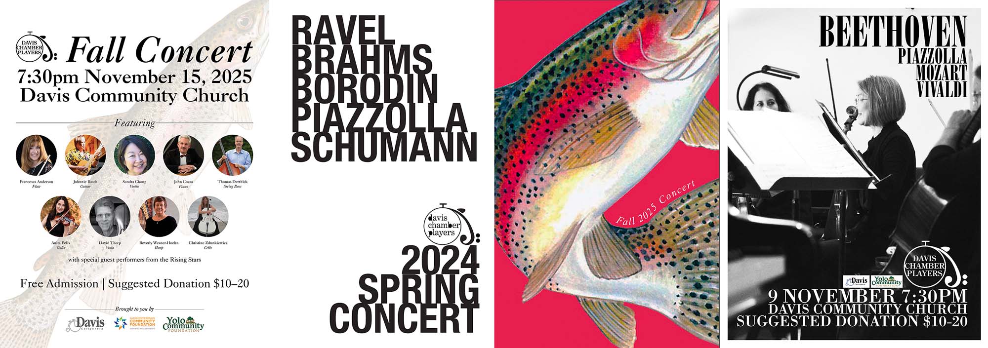
Davis Chamber Players concert posters, including a rainbow trout illustration for the Fall 2025 season

Concert promotion

The recurring work was promoting each concert. For a given season I designed a coordinated set: a poster, a one-page program, and a full concert program booklet. Rather than reuse a single template, I gave each concert a concept drawn from its own repertoire:

  • Fall 2025: The program was headlined by Schubert's "Trout" Quintet, so the season's imagery ran with it: a rainbow-trout illustration on a crimson background, with an italic serif curving along the fish's body.
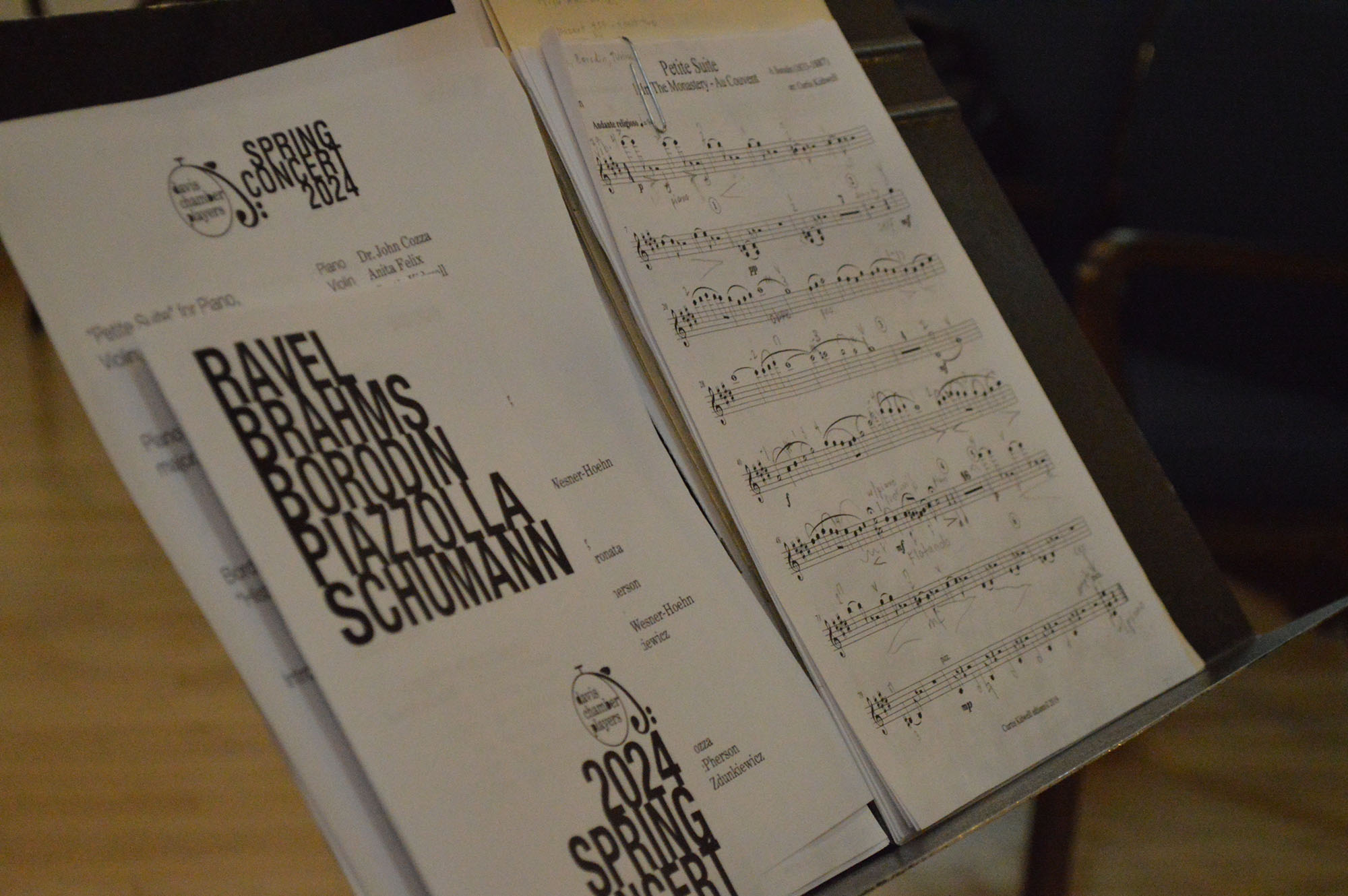
  • Spring 2024: A season of Ravel, Brahms, Borodin, and Schumann, got a type-driven treatment. Huge condensed sans-serif names overlapping at angles, layered over grayscale composer portraits and a montage of performers.

Designing similar information across varied formats and seasons was an exercise in both flexibility and consistency.

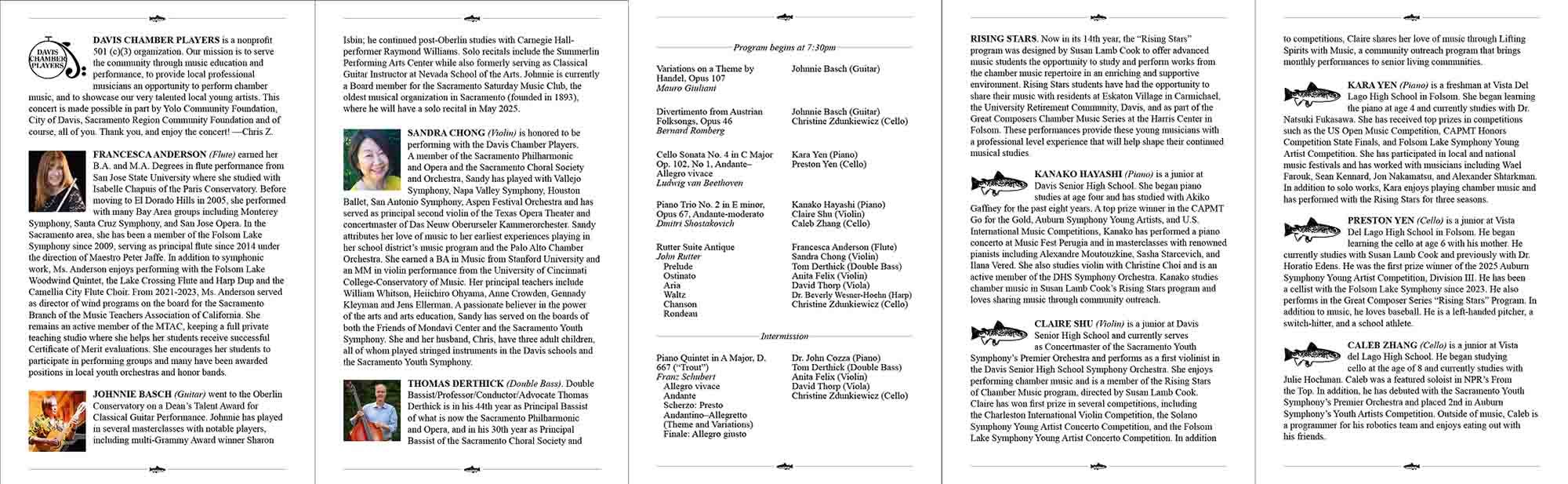
Davis Chamber Players concert program booklet spread showing the repertoire listing and a performer biography

Concert programs

The program booklets are the most text-heavy deliverables and require careful editorial design. Each issue sets a full repertoire listing: composers, works, opus and movement structure, as well as performers & instruments, for every piece. Around the program sits the director's mission note and several pages of long-form performer biographies, each paired with a headshot.

It's the kind of dense, multi-section document where hierarchy and typographic discipline keep the information clear and easy to follow.

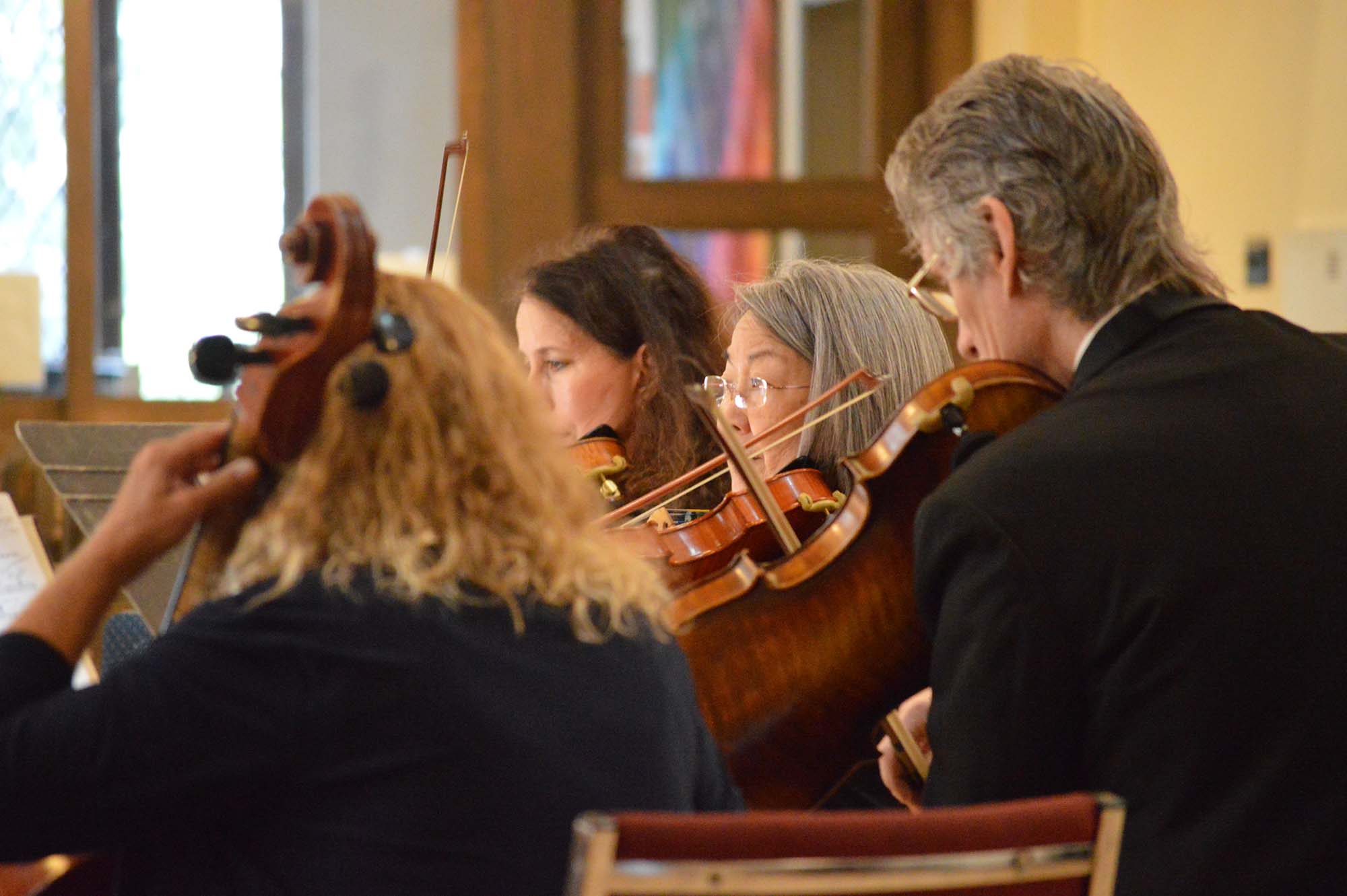
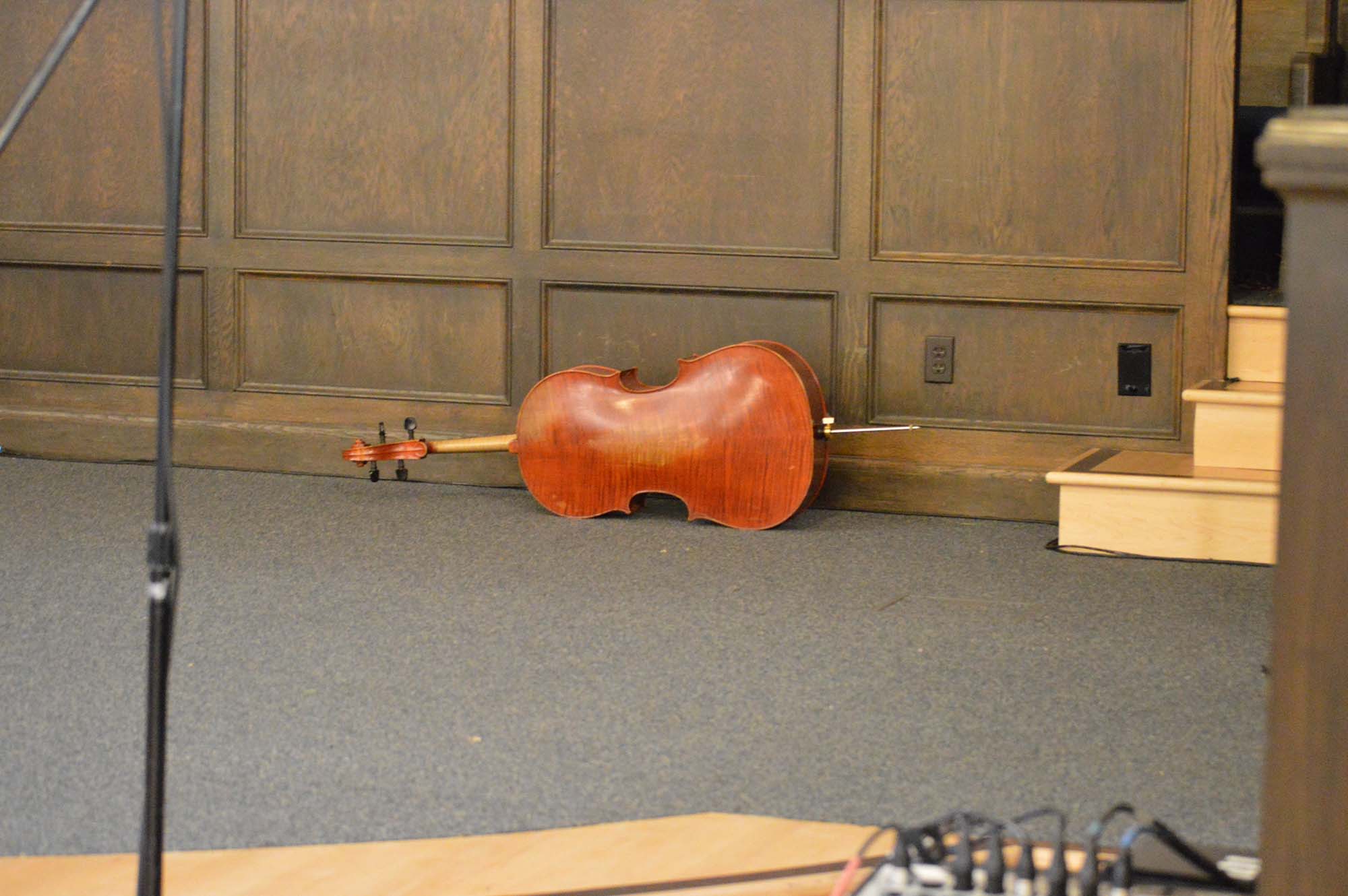
Photograph from a Davis Chamber Players rehearsal

Photography

To keep the collateral supplied with usable imagery, I photographed rehearsals to build a stock of images. This archive (aside from the performers' own supplied headshots) gives the posters and programs a consistent, in-house visual source rather than a patchwork of borrowed photos.

Davis Chamber Players branded concert materials spanning several seasons

Reflection

An ongoing engagement means the identity has to be something I can return to, extend, and occasionally reinvent, without rebuilding it from scratch. It's let me practice the full arc of identity design, from a versatile logo to a concert system flexible enough to look elegant one season and bold the next; all of it printed, posted, and handed to audiences. More than any single deliverable, it's shown me how a visual identity earns its keep over time.