SBCFSC Educational Materials
Typography + Layout + Editorial Design + Client Work
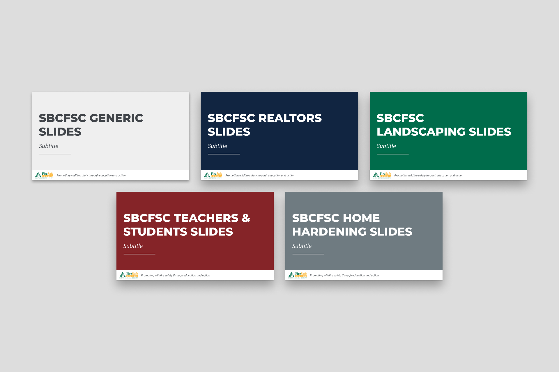
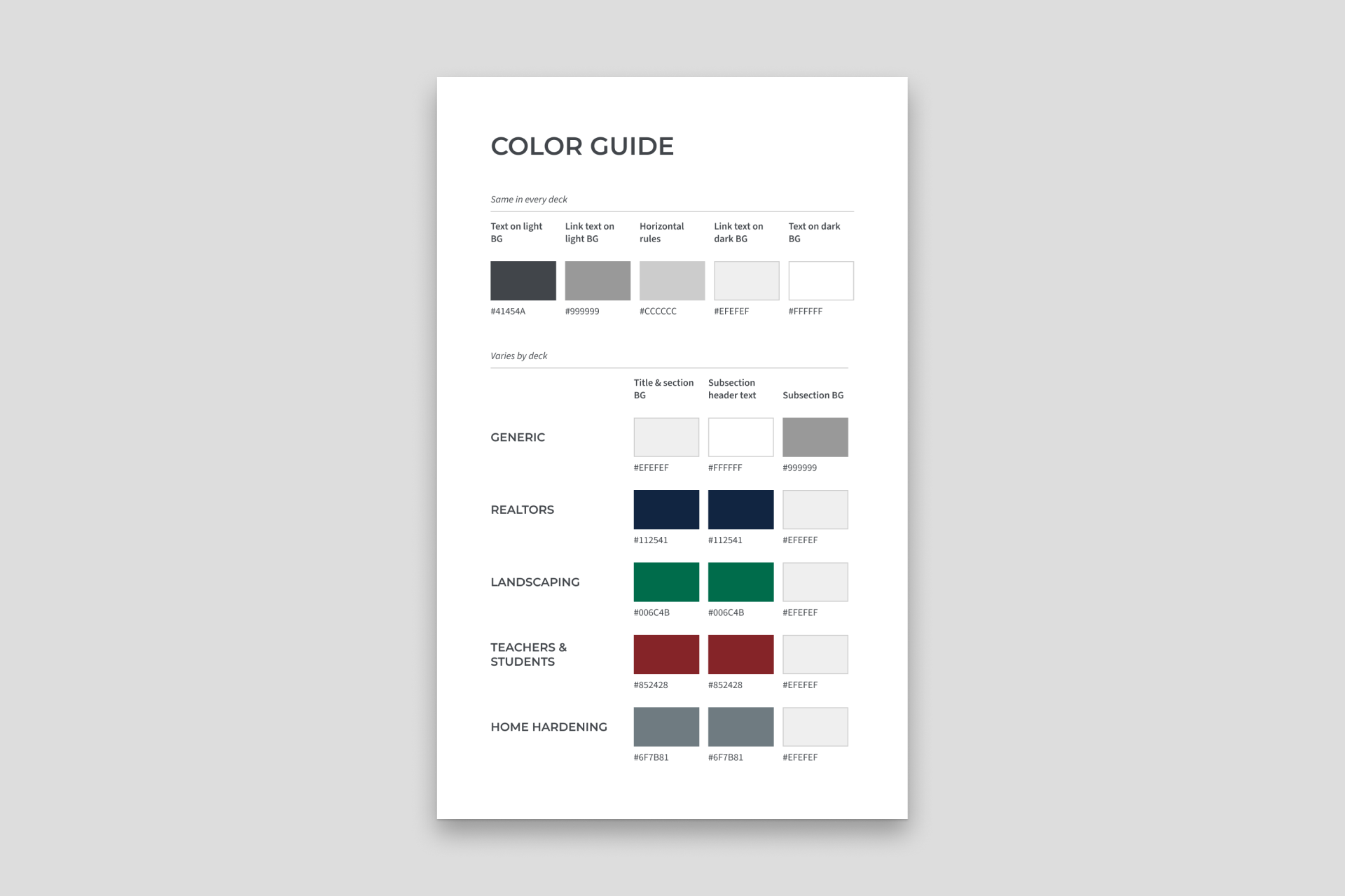
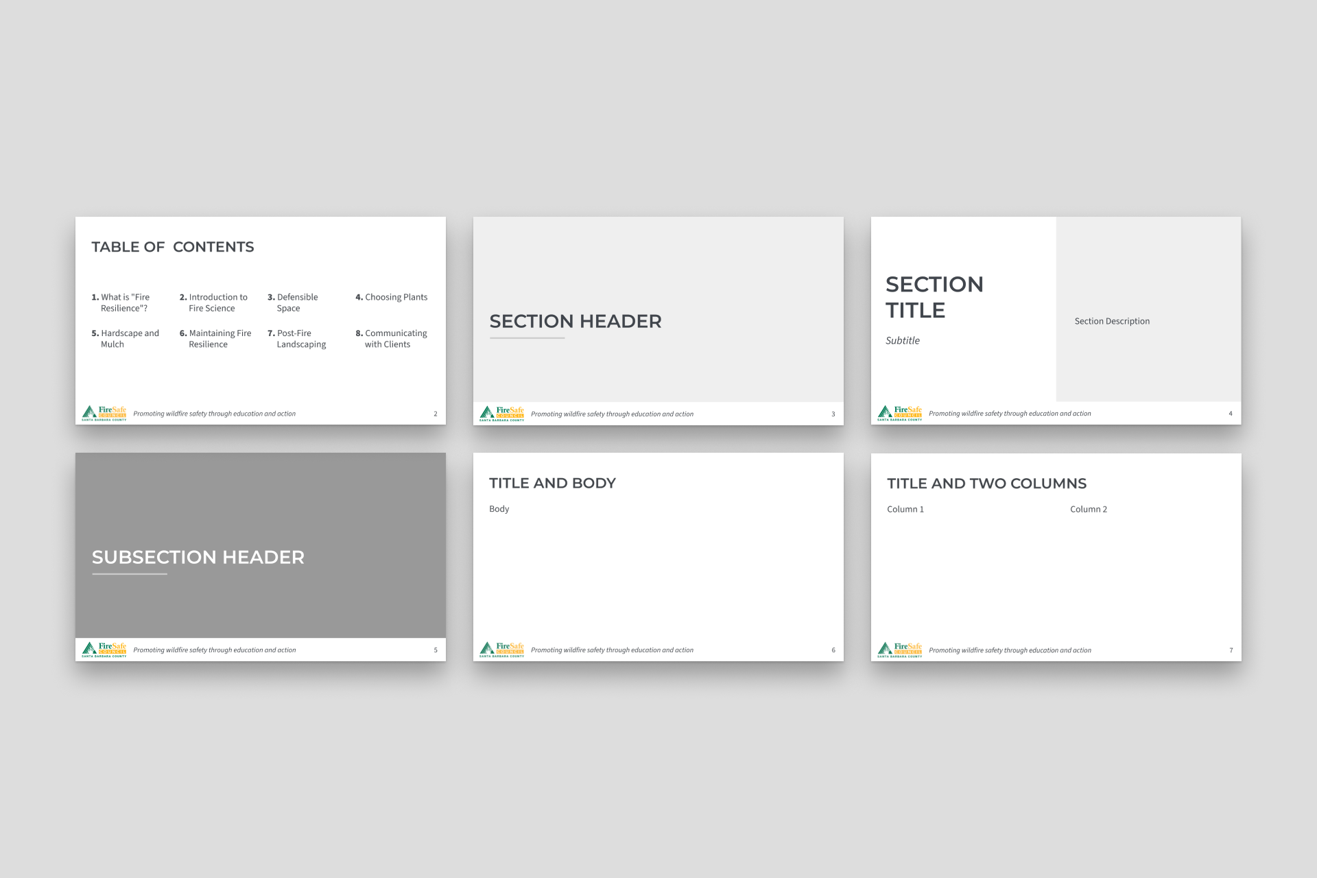
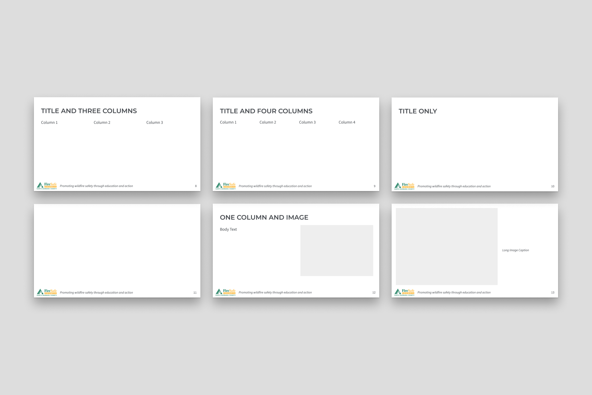
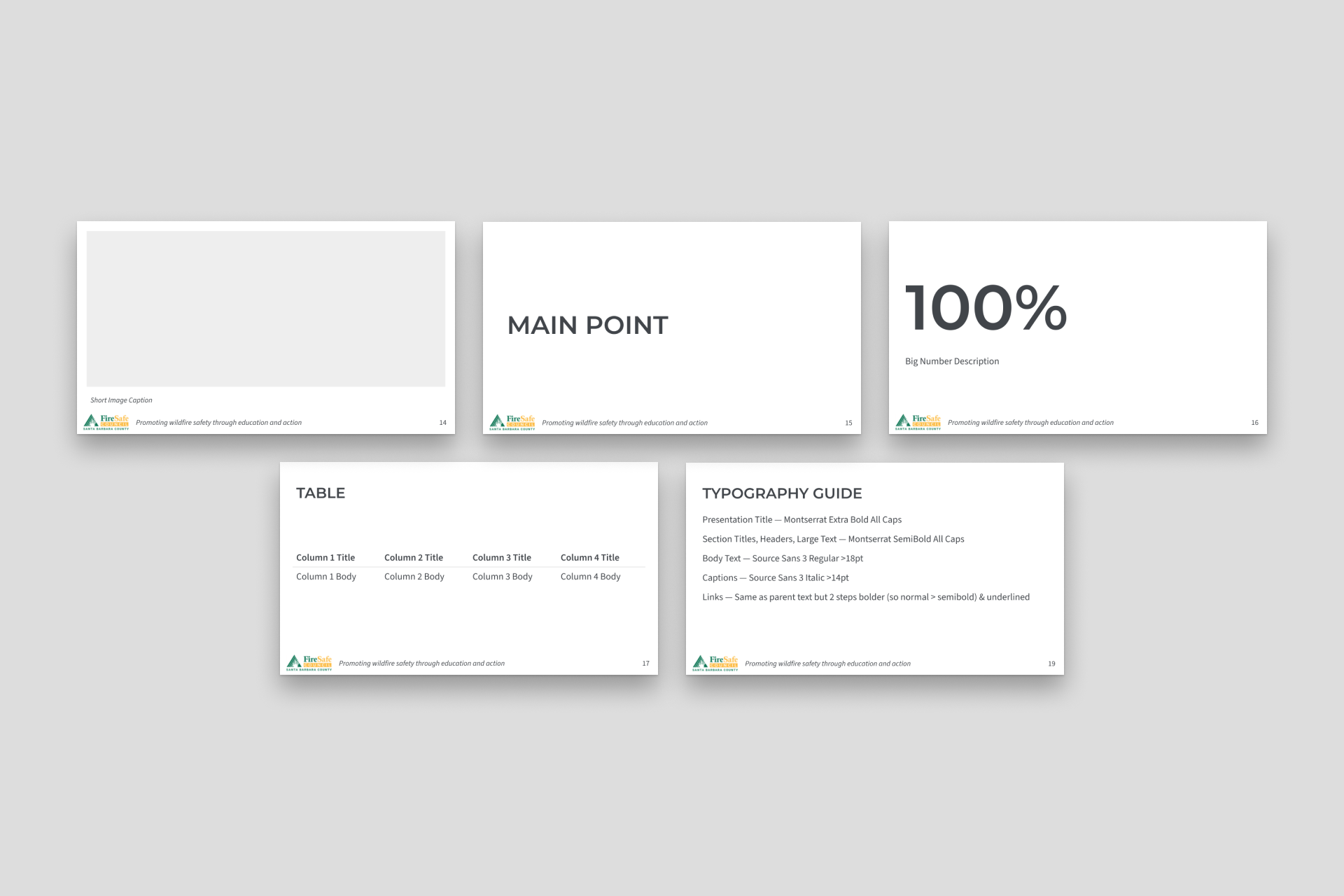
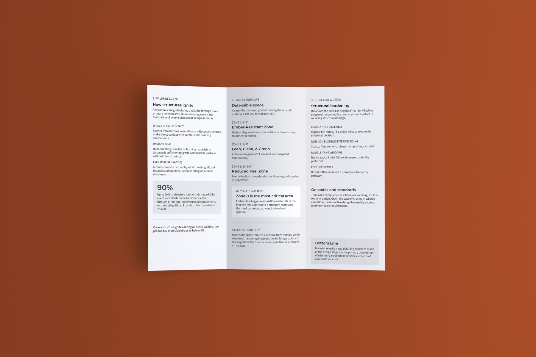
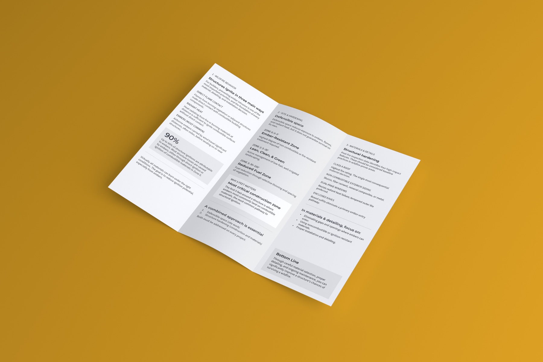
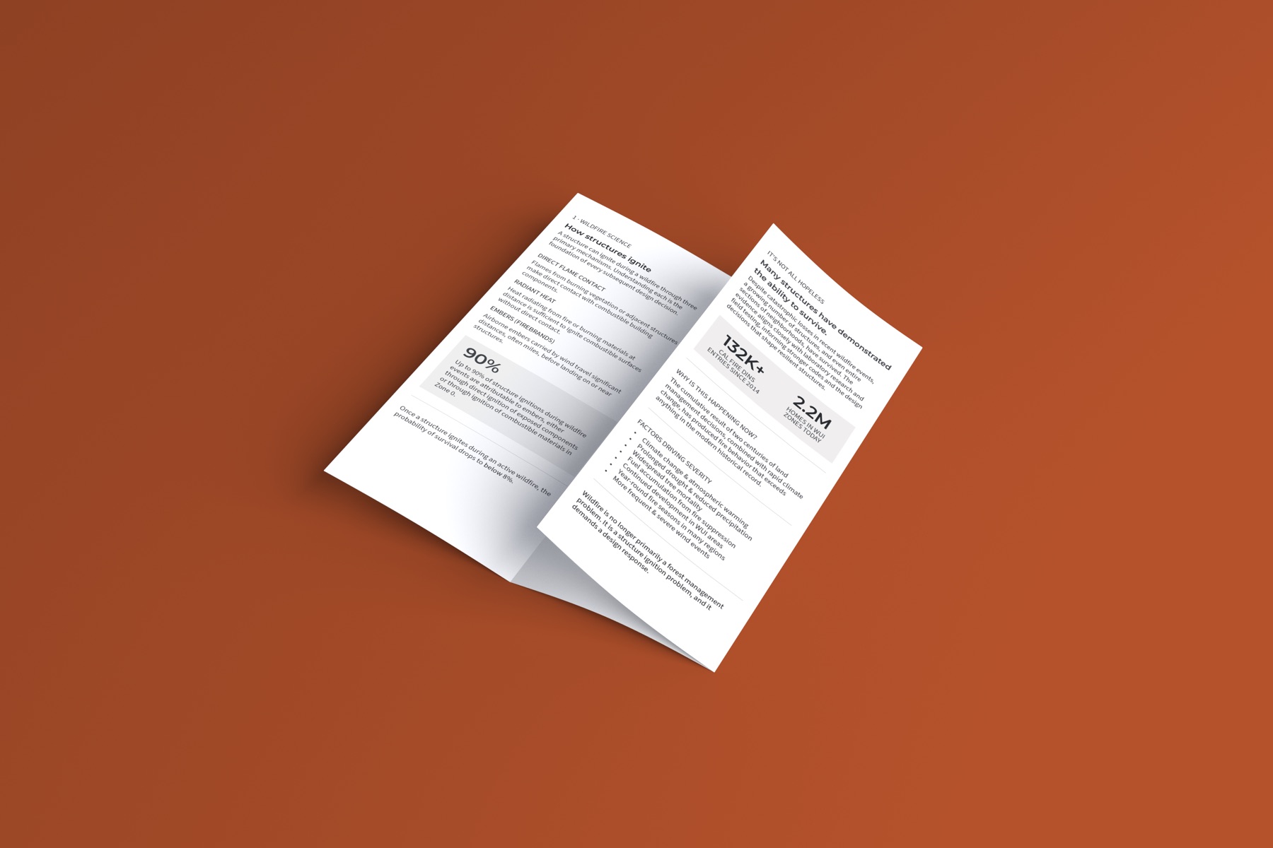
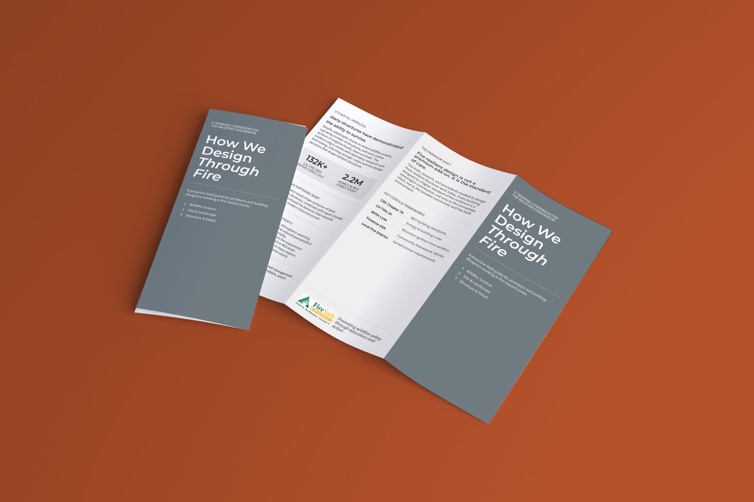
The council asked me to redesign and unify its public education materials. It provided a California Fire Safe Council style guide to work from, but I found inconsistencies in it, so I resolved those into a single coherent system that existing staff could apply: Montserrat SemiBold & Source Sans 3 on a consistent grid with defined color roles and iconography.
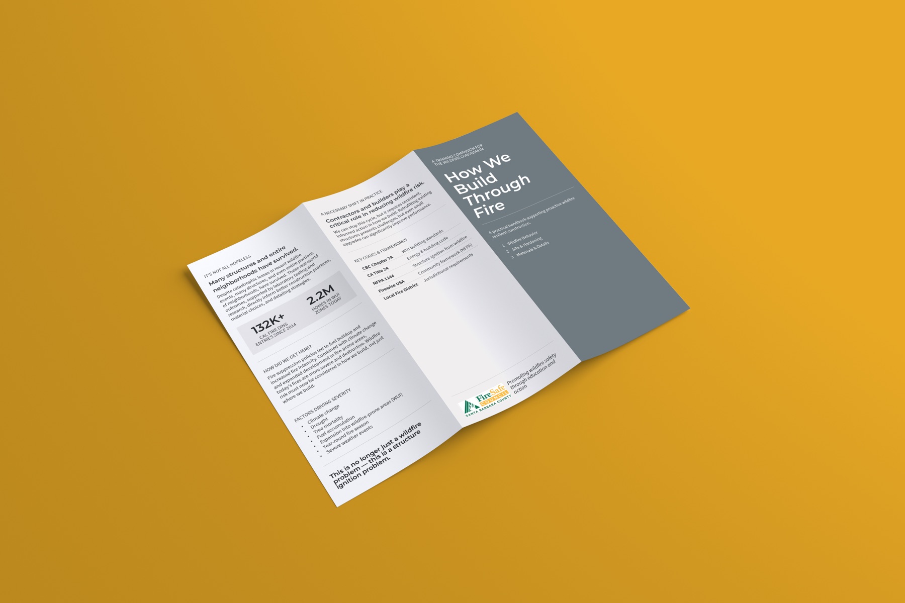
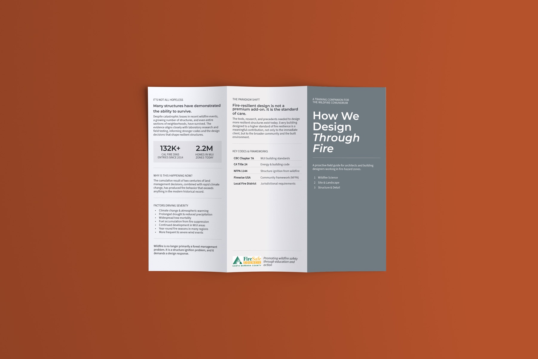
The deliverables were a set of slide-deck and print-document templates, color-coded by audience, along with applied productions for reference. These let the council produce new materials for any program while keeping everything visibly part of one identity.